How to Design Campus Commons Areas that Boost Student Engagement
When it comes to interior design, universities tend to treat common areas as an afterthought, investing most of their money and energy into classrooms, labs, and lecture halls. But with many students returning to in-person learning this semester, it’s more important than ever to invest in a campus design that enriches the student experience.
The significance of these spaces in overall student satisfaction is more important than you may think. In a recent survey highlighted by The Globe and Mail, one-third of Canadian university students say they are currently not satisfied with the university experience, with many citing isolation and a lack of social engagement as their reasoning.
A university isn’t just a medley of classrooms and lecture halls – it’s a place where students cluster, collaborate and engage with one another. While asynchronous learning worked during the pandemic, students are thirsty for rich in-person experiences, and common areas are the perfect places to allow these experiences to happen.
When designed well, common areas provide some of the most valuable student experiences on campus, offering a great opportunity to inspire students to learn outside of the lecture hall.
We’ve compiled some of our top tips in creating beautiful and functional common areas that galvanize campus culture and boost student engagement.
Rethink what an academic common area looks like
When you think of common areas at post-secondary institutions, you might envision a cafeteria, student lounge, or library. These are great, collaborative places, but common areas can extend far beyond them. According to a study cited by Fast Company, roughly 30% of the typical school building is used not for learning or interacting.
It’s time for universities to change their notions about what a common area can look like. Some of the best common areas are actually in places with lots of circulation. Lobbies, hallways, even stairwells are great pockets of the building that can make fantastic common areas.
Common areas are, by nature, multi-purpose. They could be a place for students to plug away at the day’s assignments, a meeting spot for groups and clubs, or a place for students to unwind after a three-hour lecture. For this reason, the sky is truly the limit when it comes to designing these spaces.
Offer some variety when laying out your space
Movement and access are key elements of any space, but especially public spaces. Common areas should be like banks on a river – as students meander from class to class, they need small areas to slow down, rest and recuperate. Space planning ensures students can easily navigate and access common areas, so it’s key to provide natural pathways and barriers that carve out specific panicles of activity.
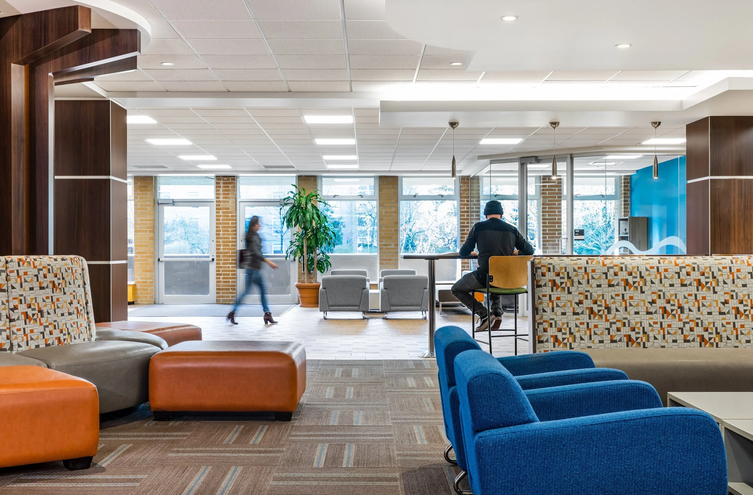
A great way to zone your common area is to provide a wide variety of seating options. High-top tables with stools and task lighting are good options for groups of students, while booth seats with partitions or walls are better for solo, quiet study.
Plush sofas with coffee tables and sightlines to televisions give students a place to socialize and kick up their feet. If you’re working with a smaller area, bench seating and smaller desks along the wall create an area for students to refresh on the way to their next class.
When selecting your furniture, you should also keep in mind the weight of each piece. Ideally, the furniture should be easily configurable and moveable for a more dynamic space, while being durable enough to withstand the wear and tear of constant use.
Showcase your university’s brand through colour and texture
Learning and concentration are not always the intention in common areas, so feel free to play with different colours, patterns, and textures here. Common areas can be a great place to showcase your school’s brand and identity.
Getting the most mileage out of your common area is pretty simple when it comes to colour. Start with neutrals to anchor your space, then spice it up with vibrant, contrasting pops of colour. In the common area photographed above, we used neutral tones on the ceilings, walls, and chairs, but incorporated pops of fuchsia on an accent wall and in the carpeting.
For certain interior designers, location plays a major role in choosing textures. Here in Vancouver, many institutions want to bring the lush, organic colours and textures of the Pacific Northwest inside.
In the space above, we used a wood slat partition to zone out a corridor space. On one side, there are doors to classrooms and offices, and on the other is a wide path with small study tables. These elements can punctuate navigation while naturally guiding the eye through the room.
Create a lasting impact on students
A university should feel like one cohesive design, where every inch of space provides an opportunity to learn and interact. Designing a world-class academic common area requires fresh, out-of-the-box thinking. An experienced interior designer can help you find innovative ways to turn these often dead spaces into hubs for student activity and campus community.
If you’re ready to design campus learning spaces that will have a lasting impact on your students, contact 34F Design today.


